[학습내용]
언어: HTML/CSS/JavaScript
배운 것: 슬라이드 쇼 애니메이션, JavaScript 셀렉터와 함수
완성 코드
[Index.html]
<!DOCTYPE HTML>
<html lang = "en">
<head>
<meta charset="UTF-8" />
<meta name="viewport" content="width=device-width, initial-scale=0">
<link rel="stylesheet" href="styles.css">
<title>CSS Shooting Stars Animation</title>
</head>
<body>
<link rel="stylesheet" href="https://cdnjs.cloudflare.com/ajax/libs/font-awesome/6.4.0/css/all.min.css" integrity="sha512-iecdLmaskl7CVkqkXNQ/ZH/XLlvWZOJyj7Yy7tcenmpD1ypASozpmT/E0iPtmFIB46ZmdtAc9eNBvH0H/ZpiBw==" crossorigin="anonymous" referrerpolicy="no-referrer" />
<div class="topnav" id="myTopnav">
<a href="#home" class="active"><img src="memorial.png" width="30" height="30"><h5>Remember Me</h5></a>
<a href="javascript:void(0);" class="icon" onclick="myFunction()">
<i class="fa fa-bars"></i>
</a>
</div>
<div class="container">
<div class="slide">
<div class="item" style="background-image: url(PIC1.jpg);">
<div class="content">
<div class="name">최재형</div>
<div class="des">러시아 한인들을 보호하고 독립운동을 지원했다. 1908년 항일단체 동의회를 조직하고 1919년 대한민국임시정부 재무총장에 선출되었다.</div>
<button>더 보기</button>
</div>
</div>
<div class="item" style="background-image: url(PIC2.jpg);">
<div class="content">
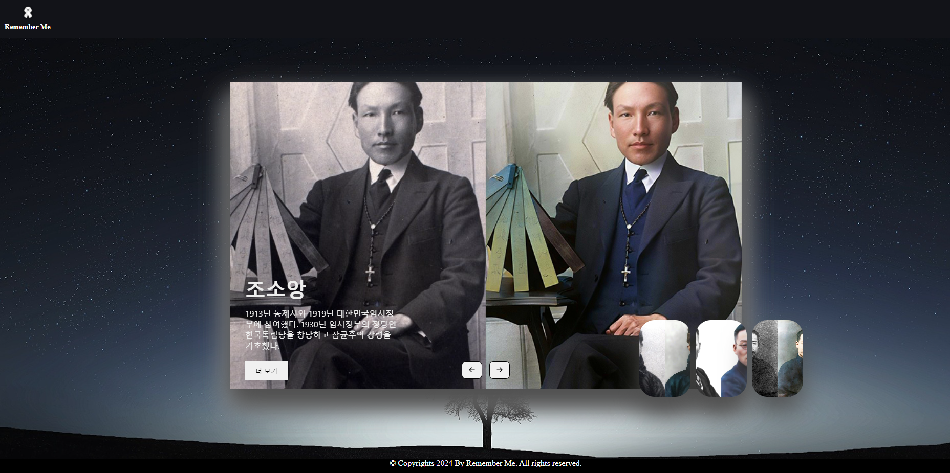
<div class="name">조소앙</div>
<div class="des">1913년 동제사와 1919년 대한민국임시정부에 참여했다. 1930년 임시정부의 정당인 한국독립당을 창당하고 삼균주의 강령을 기초했다.</div>
<button>더 보기</button>
</div>
</div>
<div class="item" style="background-image: url(PIC3.jpg);">
<div class="content">
<div class="name">이회영</div>
<div class="des">1910년 만주에 경학사와 신흥강습소를 설립했다. 1919년부터 무정부주의 운동과 대한민국임시정부 의정원에 참여했다.</div>
<button>더 보기</button>
</div>
</div>
<div class="item" style="background-image: url(PIC4.jpg);">
<div class="content">
<div class="name">송진우</div>
<div class="des">일본 유학 후 1921년부터 동아일보 사장으로 취임하여 언론운동을 전개하고, 민립대학설립운동을 지원했다.</div>
<button >더 보기</button>
</div>
</div>
<div class="item" style="background-image: url(PIC5.jpg);">
<div class="content">
<div class="name">김좌진</div>
<div class="des">대한광복회 부회장으로 활약하고 만주로 건너가 독립군을 지도했다. 북로군정서 사령관으로서 1920년 청산리대첩을 승리로 이끌었다.</div>
<button >더 보기</button>
</div>
</div>
<div class="item" style="background-image: url(PIC6.jpg);">
<div class="content">
<div class="name">한용운</div>
<div class="des">1919년 3.1운동에 민족대표 33인 중 1인으로 참여하였다. 민립대학기성회 중앙집행위원을 역임했고, 신간회 경성지회장으로 활동했다.</div>
<button >더 보기</button>
</div>
</div>
</div>
<div class="button">
<button class="prev"><i class="fa-solid fa-arrow-left"></i></button>
<button class="next"><i class="fa-solid fa-arrow-right"></i></button>
</div>
</div>
<section>
<span></span>
</section>
<footer>
<p>© Copyrights <a id="year"></a> By Remember Me. All rights reserved.</p>
</footer>
</body>
<script language="javascript" src="js.js"></script>
</html>
[styles.css]
*
{
    margin:0;
    padding:0;
    box-sizing: boarder-box;
}


body
{
    overflow: hidden;
}

section
{
    /*position:absolute;*/
    top:0px;
    left:0px;
    width:100%;
    height:100vh;
    background: url(bg3.jpg);
    background-position-x: center;
    background-size: cover;
    /*animation: animateBg 50s linear infinite;*/
}
@keyframes animateBg
{
        0%, 100%
        {
            transform: scale(1.0);
        }
        50%
        {
            transform: scale(1.1);
        }

}
span
{
    position: absolute;
    top: 100%;
    left: 50%;
    width: 0.1px;
    height: 0.1px;
    background: #fff;
    border-radius: 100%;
    box-shadow: 0 0 0 0.1px rgba(255,255,255,0.1),
    0 0 0 0.1px rgba(255,255,255,0.05),
    0 0 0.1px rgba(255,255,255,1);
    animation: animate 3s linear infinite;

}
span::before
{
    content: '';
    position: absolute;
    top:50%;
    transform: translateY(-50%);
    width:100px;
    height:1px;
    background: linear-gradient(90deg, #fff, transparent);
}
@keyframes animate
{
    0%
    {
        opacity: 0;
        transform: rotate(340deg) translateX(0);
    }

    15%, 70%
    {
        opacity: 0.5;
    }

    30%, 50%
    {
        opacity: 1;
    }
    100%
    {
        transform: rotate(340deg) translateX(-1000px);
        opacity: 0;
    }
}
span:nth-child(1)
{
    top:150px;
    right:0px;
    left:initial;
    animation-delay: 0s;
    animation-duration:3s;
}

.topnav {
    background-color: RGB(18,19,24);
    overflow: hidden;
    text-align: center;

  }

  /* Style the links inside the navigation bar */
  .topnav a {
    float: left;
    display: block;
    color: #f2f2f2;
    text-align: center;
    padding: 14px 16px;
    text-decoration: none;
    font-size: 17px;
  }

  /* Change the color of links on hover */
  .topnav a:hover {
    background-color: #ddd;
    color: black;
  }

  /* Add an active class to highlight the current page */
  .topnav a.active {
    /*background-color: #04AA6D;*/
    color: white;
  }

  /* Hide the link that should open and close the topnav on small screens */
  .topnav .icon {
    display: none;
  }

  footer
  {
    position:absolute;
    bottom:0;
    width: 100%;
    height: 30px;
    text-align:center;
    background-color: RGB(0,0,0);
    color:white;
  }

  /*Slide Show*/
  body{
    background: #eaeaea;
  }

  .container{
    position: absolute;
    top: 50%;
    left: 50%;
    transform: translate(-50%, -50%);
    width: 1000px;
    height: 600px;

    box-shadow: 0 30px 50px #dbdbdb;
  }

  .container .slide .item{
    width: 100px;
    height: 150px;
    position: absolute;
    top: 90%;
    transform: translate(0, -50%);
    border-radius: 30px;
    box-shadow: 0 30px 50px #505050;
    background-position: 50% 50%;
    background-size: cover;

    display: inline-block;
    border-radius: 20;
    transition: 0.5s;
  }

  .slide .item:nth-child(1),
  .slide .item:nth-child(2){
    top: 0;
    left: 0;
    transform: translate(0, 0);
    border-radius: 0;
    width:100%;
    height:100%;

    display: flex;
    object-fit: scale-down;

  }

  .slide .item:nth-child(3){
    left: 80%;
  }
  .slide .item:nth-child(4){
    left: calc(80% + 110px);
  }
  .slide .item:nth-child(5){
    left: calc(80% + 220px);
  }

  /* here n = 0, 1, 2, 3, ... */
  .slide .item:nth-child(n + 6){
    left: calc(80% + 330px);
    opacity: 0;
  }

  .item .content{
    position: absolute;
    top: 80%;
    left: 30px;
    width: 300px;
    text-align: left;
    color: #eee;
    transform: translate(0, -50%);
    font-family: system-ui;
    display: none;
  }

  .slide .item:nth-child(2) .content{
    display: block;
  }

  .content .name{
    font-size: 40px;
    text-transform: uppercase;
    font-weight: bold;
    opacity: 0;
    animation: animate 1s ease-in-out 1 forwards;
  }

  .content .des{
    margin-top: 10px;
    margin-bottom: 20px;
    opacity: 0;
    animation: animate 1s ease-in-out 0.3s 1 forwards;
  }

  .content button{
    padding: 10px 20px;
    border: none;
    cursor: pointer;
    opacity: 0;
    animation: animate 1s ease-in-out 0.6s 1 forwards;
  }

  @keyframes animate {
    from{
      opacity: 0;
      transform: translate(0, 100px);
      filter: blur(33px);
    }

    to{
      opacity: 1;
      transform: translate(0);
      filter: blur(0);
    }
  }

  .button{
    width: 100%;
    text-align: center;
    position: absolute;
    bottom: 20px;
  }

  .button button{
    width: 40px;
    height: 35px;
    border-radius: 8px;
    border: none;
    cursor: pointer;
    margin: 0 5px;
    border: 1px solid #000;
    transition: 0.3s;
  }
[js.js]
window.onload = function load(){
    document.getElementById("year").innerHTML = new Date().getFullYear();
}

let next = document.querySelector('.next')
let prev = document.querySelector('.prev')

next.addEventListener('click', function(){
    let items = document.querySelectorAll('.item')
    document.querySelector('.slide').appendChild(items[0])
})
prev.addEventListener('click', function(){
    let items = document.querySelectorAll('.item')
    document.querySelector('.slide').prepend(items[items.length - 1])
})
결과물
반응형
'One Hour Coding Challenge' 카테고리의 다른 글
| [1HCC] DAY - 007 - 버튼 (0) | 2024.08.21 |
|---|---|
| [1HCC] DAY - 005 - JavaScript 변수 삽입 (1) | 2024.02.27 |
| [1HCC] DAY - 004 - Footer 삽입 (0) | 2024.02.22 |
| [1HCC] DAY - 003 - 메뉴바 꾸미기 (0) | 2024.02.21 |
| [1HCC] DAY - 002 - CSS 배경 애니메이션 (0) | 2024.02.20 |


댓글